.
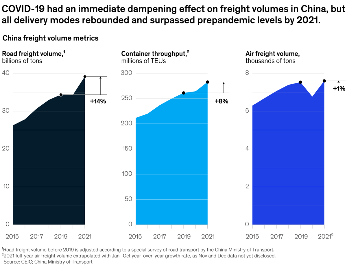
| ALL THE WEEK’S DATA THAT'S FIT TO VISUALIZE | | | Our Charting the path to the next normal series offers a daily chart that helps explain a changing world—during the pandemic and beyond. In case you missed them, this week’s graphics explored the effects of the pandemic on shipping volumes in China, how mobility players are keeping pace with the effort to limit warming to 1.5 degrees C, the transition to electric mobility in sub-Saharan Africa, and the relevance of various risk types to European leaders across several industry sectors. | | FEATURED CHART | | China makes, the world takes |
| | This week’s other select charts | | | This email contains information about McKinsey’s research, insights, services, or events. By opening our emails or clicking on links, you agree to our use of cookies and web tracking technology. For more information on how we use and protect your information, please review our privacy policy. | | You received this email because you subscribed to The Week in Charts newsletter. | | | | Copyright © 2022 | McKinsey & Company, 3 World Trade Center, 175 Greenwich Street, New York, NY 10007 | | | |


No comments:
Post a Comment